Personal Project (2023)
TOMO
A mobile application to help gaming content creators find like-minded individuals to collaborate with.
UX/UI Design
UX Research
Mobile Application
End-to-end


01. Challenge
Gaming content creators struggle to find collaborators who align with their play style, goals, and personality.
Streaming has grown rapidly since COVID-19, with over 3.5 million new creators joining Twitch. While streaming offers opportunities to connect, creators lack structured ways to discover collaborators who align with their interests and goals.
Problem 1
There is no structured system for discovering potential collaborators.
Problem 2
Initiating collaboration with strangers is anxiety-inducing due to uncertainty and the potential for negative social interactions.
My Role
As the UX/UI designer, I led the end-to-end design of a mobile experience that enables gaming content creators to discover compatible collaborators in a structured, low-friction way.
02. Final Solution
Below are key flows that address the problems discussed above.
Community Dashboard
A centralized hub that gives gaming content creators a snapshot of what’s happening in their community.
Trending: Highlights popular games within the community, helping creators discover titles that may lead to more collaboration opportunities.
Creators: Showcases potential collaborators based on shared interests, increasing visibility and connection opportunities.
Forum: Displays recent posts from the community, offering a space for creators to ask questions, share experiences, and support one another.
Finding a collaboration
There is currently no structured way for content creators to view key information needed to decide whether to collaborate with someone.
To address this gap, each collaboration post displays essential details including the game, date, host, and other information to support decision making.
Content creators can use search and filter features quickly to find games they are interested in.
After selecting a post, content creators can view additional details to determine if the collaboration is a good fit.
Opportunity to learn about potential collaborators
Before reaching out, many content creators try to learn more about potential collaborators but that information is difficult to find.
Instead of searching through multiple sites or platforms, content creators can view everything they need in one place.
Each profile includes:
Responses to interest prompts
Games they play
Stream clips
Upcoming collaborations
03. Research Strategy
I conducted online surveys and user interviews from gaming content creators to understand their motives and process in finding other creators to collaborate with.
Why become a content creator?
Connect with like-minded individuals for an enjoyable gaming experience and build a supportive social circle.
Some shared past experiences of toxic interactions when trying to find teammates through online forums. By collaborating with other content creators, they feel a greater sense of security as they have the ability to research and assess compatibility in advance to avoid uncomfortable interactions.
Current methods for finding collaborations
Discord servers and Twitter were the most common platforms used. Creators vet others by reviewing social media profiles to evaluate personality, content style, and overall likability.

Important Criteria for Choosing Collaborators
From a Likert-scale survey, creators rated these five factors as most important. Additionally, many creators noted they are more likely to collaborate with someone if they share mutual friends, as it adds a layer of trust and familiarity.
Why are finding collaborations difficult?
Lack of information available about potential collaborators
Many creators, being introverted and cautious about meeting new people, prefer to have information about potential collaborators before reaching out; however, it's not always readily available.
Hesitant to make posts due to unspoken first-come, first-served rule
Creators are often obligated to accept someone who expresses interest to their post on a first-come, first-served basis, even if they don't necessarily want to collaborate with that person.
Information is not easily accessible
The ineffective organization of posts in Discord servers, along with the limited accessibility of crucial information makes it difficult to find collaborations of interest.


Key Takeaways
Takeaway 1
Many become content creators to form a community of people to game with but many suffer from social anxiety.
Takeaway 2
Due to previous negative interactions with people online, content creators put in time and effort before reaching out to others for a collaboration, which can be taxing.
Takeaway 3
Content creators need:
A safe and pressure-free environment to connect with others.
A structured and accessible way to review collaborator information, helping creators make more informed, intentional decisions.
Finding inspiration from competitors
To inform my design decisions, I conducted a comparative analysis of apps with similar goals, including ePAL and dating platforms, to explore proven patterns for connecting users with shared interests.

04. Ideation
Drawing from user research, I created user flows for both finding collaborators and creating a collaboration post. However, due to time constraints, this project focused exclusively on designing screens that support the flow of discovering collaborators through existing posts. The flows for creating a post or accepting collaboration requests were not explored.


05. Branding
TOMO means friend
As the primary goals of content creators were to create new friendships, I named my product “TOMO”, which is the word for “Friend” in Japanese. The name reflects the app’s core mission: to provide a safe, welcoming space where creators can connect with like-minded individuals and build genuine relationships.
Designing the logo
The gaming controller motif is created by two people forming a circle through a hugging gesture, representing a community of gamer friends.
The people in the design also resembles eyes, highlighting the viewership aspect of streamers in the gaming community.
Style tile
“TOMO” is built around the values of connection, trust, and happiness, which are conveyed through a calming, blue-centric color palette.
To cater to the gamer demographic, a darker shade of blue was chosen as the primary color, complemented by pink accents to create visual contrast and highlight key actions.

06. V1 High-Fidelity

Home dashboard
Trending games: Games that are popular among the community
Recommended Collabs: Collaborations that might interest the user
Upcoming Collabs: A reminder for all upcoming collaborations
Creator Spotlight: Content Creators that might interest the user based on interests
Community Forums: Recently posted forums from the community
Collab(oration) page
Displays a list of currently available collaboration opportunities.
Includes filter, sort, and search functions to help users find collabs that match their interests.
Allows users to create and publish their own collaboration posts.
Mutuals
Users can easily identify collaboration posts involving mutual connections by looking for the mutual icon displayed above.
Knowing that a potential collaborator shares mutual friends helps foster a greater sense of trust and safety.
A toggle switch allows users to filter the list and view only posts made by mutual connections, making it easier to find collaborators within their extended network.

Selected collaboration post
When a content creator selects a specific collaboration post, they are taken to a detailed view of the collaboration. This page includes both the Info Tab and Group Tab, allowing users to review key details to help users determine whether the collab isa good fit before requesting to join.

Info tab
A brief description of the collaboration's purpose or goals
Game settings (e.g., platform, game mode, region)
Scheduled date and time for the collaboration

Group tab
Displays a list of all participants involved in the collaboration.
Users can tap on any creator’s profile card to view their full profile and learn more before deciding to join.
Creator profile page
The Creator Profile Page offers a deeper look into each creator’s personality, interests, and gaming habits.
Bio

Games

Clips

Collabs

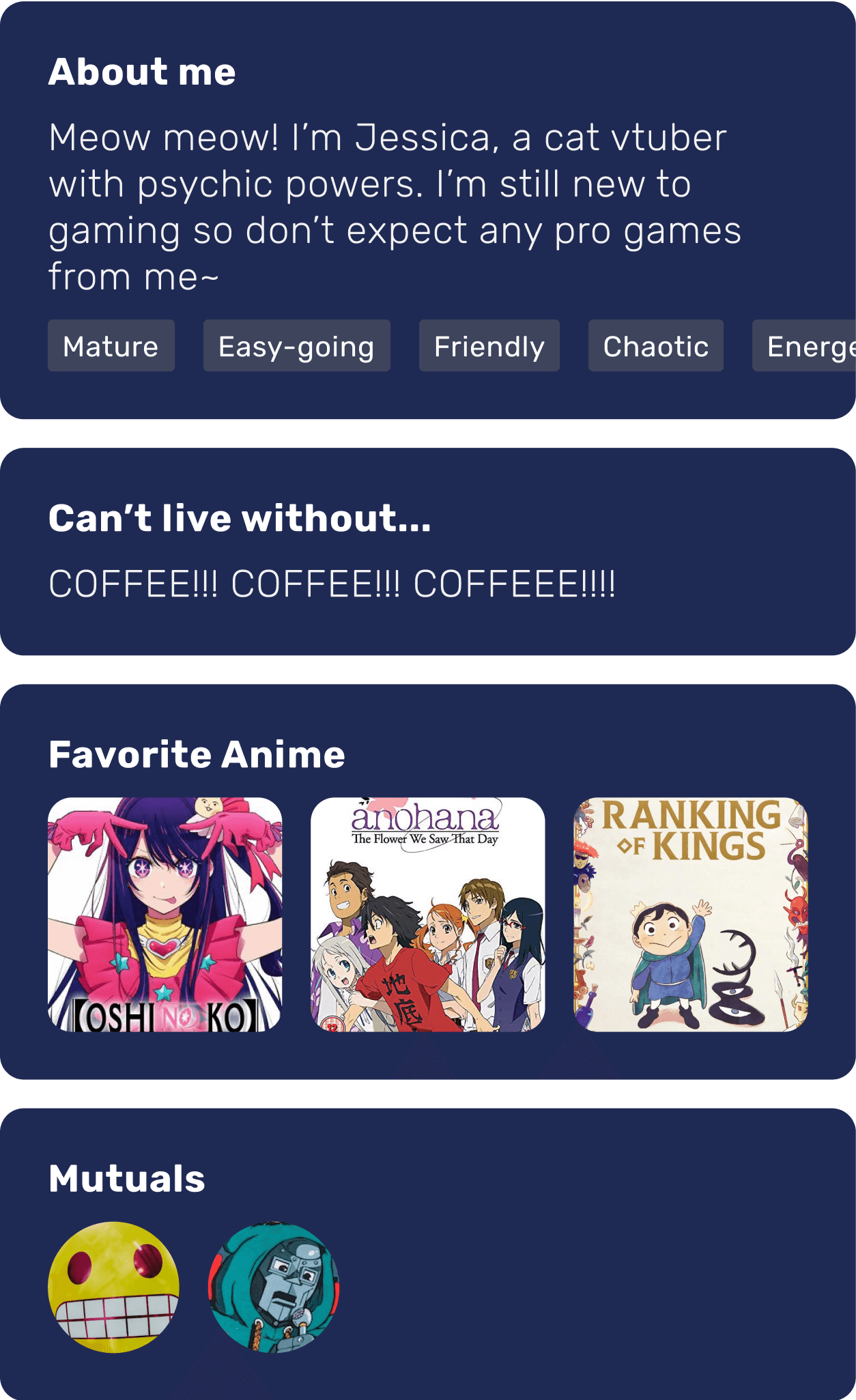
Creator profile prompts
Creators can showcase their personality and interests by responding to a series of curated prompts.
These prompts highlight each creator’s individuality and make it easier to identify shared interests to spark meaningful conversations.
Users can also see any mutual connections they share with the creator, adding a layer of trust and familiarity.
Creator games
Users can browse a carousel of games that the creator plays.
Selecting a game reveals additional details about the creator’s rank, server, and console.
Each game card includes personal commentary written by the creator. It may include what they’re looking for in collaborators or how they typically engage with the game.

07. Testing & Iteration
“This is awesome! I love how organized it is. When is this going to be released?”
Many users expressed positively to how the collaboration system works. They particularly liked how easily accessible information regarding collaborations were and the information provided on the profile page.
Across all users, there were consistent problems during the usability testing that must be addressed.

Collab Card

of users could not navigate to creator’s profile page
Cards were indistinguishable
The collab and profile cards looked too similar, leading to confusion and low interaction with the profile card.
Poor text hierarchy
Lack of clear visual hierarchy made the card content difficult to read and scan.
Collab card iteration
Removed creator tags
Tags lacked clear purpose or meaningful context, and were removed to reduce visual clutter.
Improved readability
Applied color coding and text styling to create stronger visual hierarchy and make key details easier to scan.


Profile card iteration
Redesigned profile card
Switched to a square profile image occupying one-third of the card, creating clear visual distinction from the “Collab” card.
Removed unnecessary information
Removed the intro text and game rank to reduce clutter and prioritize key details like tags users identified as most important during testing.
Creator profile page iteration
Standardized profile visuals
Updated the profile image to a square layout for consistency with the Profile Card design.
Enhanced information hierarchy
Removed the navigation bar to reduce visual clutter and help users stay focused, as it was found to be distracting during testing.


Rethinking what is essential...
Removed overlapping pages
Removed “Homepage” due to significant content overlap with the “Community” page.
Reorganized navigation to support creator goals
Prioritized easy access to the collaboration schedule to better align with user preferences and task flows. Also moved the “Messages” feature from bottom to top navigation to reflect lower usage while still keeping it accessible.
08. Lessons learned
Not all information must be presented at all times
In an effort to streamline user tasks and reduce complexity, I initially presented a lots of information on the cards. However, this led to a cluttered design. As a result, I have learned to prioritize what is most important to users at each step, allowing for cleaner and more user-friendly designs.
Excessive consistency can sometimes hinder the design rather than benefit it
Due to designing the 'Profile' and 'Collab' cards too similarly for consistency, many users had difficulty distinguishing between them. It is crucial to employ distinct designs that assist users in differentiating various components of the interface to accomplish their goals effectively.
